Friday, 9 March 2012

Evaluation Question Four

How did you use media technologies in the construction and research, planning and evaluation stages?


Throughout the project I used various forms of media to create, edit and design elements of the project. I realised that the more I used these media technologies, the more successful the project would be.

Camera:

This is the Canon Powershot A1100IS as I mentioned in an earlier post.
I used it for the entirety of the music video filming, as I thought that changing camera half way through would break continuity in terms of the quality of the video and look very odd to the audience.
The main reason for choosing this camera was the limited availability of better cameras, but all it retracted from my video was the HD quality that would have made it look more professional as noted in some of the audience feedback.  I still managed to demonstrate my editing ability and make a finished product that was affirmed by the audience feedback.


Lighting:

Lighting was something that I was wary about while planning this project. This was mainly because I planned to film in the open, which can often have glaring lighting issues and continuity problems if secondary shoots are required.

Due to the time of year it was also hard to find a day that had consistent lighting - clear skies all day or complete cloud cover. I chose to film during the day time on a cloudy day so that the sun would not produced too much glare. 


During the post production phase I realised that I wanted to make a lot of the shots darker to convey some of the themes that were contained in the song. This would have been virtually impossible to do while filming without an enormous budget, so the only way it could be done was during editing.


Final Cut Express:


I used final cut express, mainly in the post production phase of the main video. I also used it during the lip synch practice at the end of last year to practice using the software. 

This program is used in the film and television industries, so is a professional piece of software. We did use the express version, which does have a few less features than final cut pro, but the way footage is cut together is still the same and still requires a decent amount of skill to use. 

I found this was a very useful tool as I could very precisely cut clips together and use other tools such as slowing down clips and colour correction

Colour Corrector - what the interface looks like

This is an example of what the colour correction tool looks like while in use. It allowed me to choose the colour to make the footage and change the level of white, mids, blacks and saturation. I often turned down the mids and turned up the blacks to make the shadows darker as well as turning up the saturation slightly to make the colour more vibrant.

Overall this was an incredibly efficient tool and allowed me to add most of the basic filters, transitions and colours that I needed.


Adobe After Effects CS3:


This was a piece of software I had never encountered prior to my music video and it required a fair amount of playing around with before I knew what I was doing.

While trying to figure out how to use the program I took some footage of the motorway and tried to make it rain and make the rain purple. I managed to add an effect that made it look like it was raining, but I could not figure out how to make the rain itself purple. From this experimentation I did find out how to add a clip and add some basic effects. I also figured out the rendering process, which is different to final cut and was slightly more complex.

In my music video I used After Effects to create a clone of the artist appear next to the original and then be banished by her. This involved placing a different clips that was shot from the same position over the top of the original. I had to select a certain area because the two shots didn't match up perfectly and the wind was blowing the trees which made it impossible even if the shots were framed exactly the same. I selected the area around the artist of the second clip and made it slightly transparent to give a ghostly effect and also not make the borders around the selected clip clash so obviously with the original footage. This was probably the hardest part as it took a while to get the two clips matched close enough. Adding the ripple effect was just a matter of timing, although I did find it a bit fiddly as the default effect was the reverse of what I wanted,  so I spent a while trying to reverse the effect.

An example of a clip being edited in After Effects


Overall this was a very useful tool and I was impressed with the end result as it looked far better than anything I could have done with the stock effects of Final Cut.


Photoshop CS3:


I used Adobe Photoshop CS3 extensively throughout the production of the digipak and magazine advert. This was not the first time I had encountered this program so I knew how to use quite a few of the features already. This meant that I was able to go straight into using the various tools available and didn't have to spend any time figuring out how to use it beforehand. I used photoshop during GCSE Media Studies in the creation of a magazine front cover and double page spread, from which I remembered the techniques that are used a lot in magazines to capture the audience's attention.

At the beginning of the year I carried out a quick Photoshop task that involved making a mock-up of an album cover that involved combining two or more images together. This helped me familiarise with some of the tools and tricks I had learnt in GCSE and gave me ideas as to what I could do for the digipak and magazine advert.

The main features of Photoshop I used were Replace Colour, Adjust Brightness/Contrast, Lasso, Magic Wand and filters (used to add the blurred effect on the artist's face). 

Filters menu

Replace Colour

Blogger:


Blogger was the most important tool while documenting my production process. It houses all the research, development, planning and links to final products in my project. It is a very useful way of recording my progress as I can look at it from anywhere that has an internet connection, rather than having to have the file. It also means that my classmates can look at my blog and give me constructive criticism and I can do the same to them. 

Blogger allows the integration of video clips, pictures and embedded apps from other websites such as scribd and slideshare as well as many others. This means that I can make posts filled with various forms of media and share information in ways that I wouldn't be able to if I had to do all this using a word processor.

YouTube:


YouTube, a site where people from all over the globe can watch, create and share videos, was an important part of the process. It is here I have my music video uploaded, which means that I can simply provide the link to anyone that wants/needs it and they can view it. It is a very simple and very effective site and has been integrated with so many different places including here on blogger, which results in me being able to easily embed videos from YouTube in posts I make.


Personal Conclusion:

I have utilised all the previous forms of media technology to their fullest potential to produce what I believe are three successful (in terms of what I set out to do) products. Their degree of success is, however, something I am about to address.

There are several things that I would do to improve if I did this again:
  1. Use an HD camera - this was something that was picked up on during audience feedback and it is also something I thought about during filming. Having a cam-corder that filmed in High Definition would have given my film a more professional look, which, although it would have meant any slight error being more noticeable, would have been worth the extra time spent editing. 
  2. Use a tripod for all my shots. This was another thing noticed by the audience as well as myself during editing. Shots that were meant to be static weren't always, which broke some technical continuity. 
  3. Come up with more of a structure in terms of narrative. This is just something that I would have liked to have done give more time and planning. I think that having a narrative in my video may have given away more of the almost cryptic meaning of the song.
  4. Spend more time rehearsing the song with my actor. I only gave my actor a few days to listen to the song and remember the lyrics, which she did without me as she was at University. She was also fairly busy at the time so it was hard for her to remember the lyrics even with practice. I would give her more time to practice and be there with her to act out some of the planned shots
This being said there are things that I think I did well such as 
  • Editing - this is a fairly broad area, but I did not receive any criticism for the editing of the music video from my audience and I personally think that it looks as good as I could have made it with the reduced video quality.
  • Ancillary pieces - I think that my digipak and magazine adverts were successful in looking realistic and linking both to each other and the video through the common images and fonts etc.
Overall I am pleased with my final results and think that I was able to produce products of a high standard that were worth the time and effort I spent making them.


Thursday, 8 March 2012

Evaluation Question Three

What have you learned from your audience feedback?


This is the questionnaire I made to give out to 30 people to evaluate the final cut of my video.
Below is an example of a filled out questionnaire:


Feedback Summary:


Question 1:

This shows that there was a wide variety of ages that took the survey, though the largest single group was 16-19 and made up 50% of the survey.

Question 2:


This suggests that there was a fairly even balance between male and female.

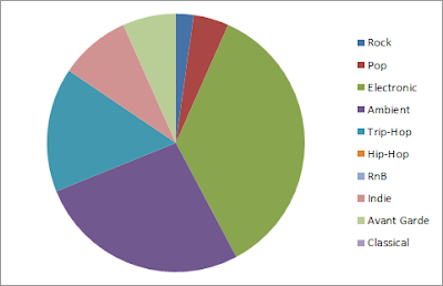
Question 3:


From this chart, you can see that the three genres that the audience thought the video sounded like the most were Ambient, Electronic and Trip-Hop, which are the actual genres that the song belongs to. This is what I had hoped the audience would think and suggests that the video correctly represents the genres it belongs to.

Question 4:


This shows that the audience has a wide range of musical tastes and will interpret the song in different ways.

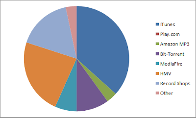
Question 5:


This diagram represents the different methods of obtaining music that the audience use and shows that they all use varying methods.

Question 6:


About a third of the audience asked said they listen to music on the go and the rest mainly used methods related to sitting at a computer.

Question 7:


This represents the themes that the audience thought the music video contained and the theme that most thought it contained was defiance. This was probably mainly due to the name of the song, which does suggest a certain degree of defiance. The other largest themes were contrast, determination and darkness, which were the main themes I wanted to try and convey. From this I have learnt that the themes were fairly easy to discern, but I could have made it more obvious by having a bit more visual imagery.

Question 8:


This is the question that asks whether they know any other artists/bands that are similar to this one and the majority said they didn't, which suggests that it would be harder for an artist like this to get popular because there are few other artists to compare her to and the audience may find it harder to relate to her.

Question 9:


About 70% of the audience thought the video looked professional, which is encouraging to see on a video which is actually amateur in almost every sense of the word. 

Of those who said no, several said that it would have looked more professional if I had used an HD camera and used a tripod for some of the shots where I had not.

Question 10:

The most common positive said about the video was that they liked the editing effects, especially where the lyrics were about magic and a copy of the artist appeared and then the original mimed shooting the copy and it vanished using a ripple type effect.

They also liked the colour correction making it look darker.

Question 11:

A lot of people said that I should have used an HD camera as the quality made it look more amateur and was only saved by the colour correction. 

They also said that using a tripod on some of the shots would have made it more professional and easier to watch.

Question 12:


Of the 30 people, 12 said they would get the song and 18 said they wouldn't. This was likely due to the genre of the music rather than them not liking the video, as most of them said it looked professional and I didn't receive many negative comments other than about the technical approaches I used.

Question 13:

The average rating give by the audience was 7.5, which suggests that the audience I gave the questionnaire to generally liked it.

What I have learned from audience feedback:

From the audience feedback I have ascertained that I should have used a tripod for more of the shots to give continuity to the shots and make them look smoother. 

Along with the tripod I should have used an HD camera to give it a more professional look. 

I also learned that my video was fairly successful at conveying the themes contained within it and what genres it belonged to.

Constructive criticism aside, I still believe that my video was generally successful in its original aims and the audience received it positively.

Evaluation Question Two

How effective is the combination of your main product and ancillary texts?


The song I decided to use for my music video was I'm Not Done from the self titled album by Fever Ray. 


To accompany the video I thought that the best combination, for a song of this genre (ambient/electronic/trip hop), was a digipak and a magazine advert that would link to each other and the video itself through common themes such as contrasting colour.

To link the three products I took a screenshot from the video, along with some editing in Photoshop, and used it as the album front cover. I took the album front cover, and used it as the main image in the magazine advert, which I did following research into how real magazine adverts have been produced for music albums.  Another method I employed to link the products was to use the same (and similar) font(s) across all the ancillary texts. 

I tried out a number of fonts to try and decide which to use in through both the digipak and advert.

The font I decided on was Courier New (the first from above), which I used for the name of the artist and single. I chose this font as a starting point as it resembled a typewriter, which gave it a rudimentary style as the typewriter is old fashioned and not as complex as the methods used to type in the present. I wanted to make the font look simple and understated so as the audience would not be distracted by any fancy fonts or attractive colouring. To distinguish between the artist name and the single I made the single name in italics, which made it separate from the artist name without being too different.


For the magazine advert I wanted to keep the same fonts, but there was more to be written on it. I decided to use fonts that looked similar to this one, but not exactly the same so as to add some variation.

(Taken from the magazine advert)

(Rockwell Font, used to make the quotes stand out from the other text)

In terms of linking the ancillary products to the music video, I think I did a fairly effective job and the three can be easily associated with each other.

I aimed to build the artist as a fairly reclusive, dark, serious and soulful woman, but also strong willed and determined. I think the setting of the video gave it the reclusive and dark aspect I desired, but it was harder to make her seem strong willed. Her physical movements during the last verse before the bridge make her look the most determined, but looking strong willed is something that is hard to pull off in a music video. I decided to drop the strong willed aspect of her personality, as the other aspects still created the desired effect and being determined does generally connote being strong willed. 


The front cover takes a shot from the video of the artist while running, which stands out from other more common poses that female artists take for the front cover of their album. This is done to emphasise her uniqueness and the fact that she has not deliberately prepared for the shot connotes that what she does comes naturally to her and she doesn't need to put on a fake pose. The contrast between her and the woods in the background makes her stand out and connotes her independence, while the shadow cast by her face across her neck keeps the dark overtone I wanted to have throughout the three products.


The magazine advert is very similar to the digipak in the way it builds the image of the artist, but it also emphasises her more as she has an entire image to herself as the text it is above it. The woods to the left of her makes her stand out even more as she takes the central position. The black borders above and below the main image also add to the theme of darkness and seriousness. The white text on black background fits with the theme of contrast along with the record label which is white on black as well.

In conclusion, I think that I have managed to effectively use the combination of the music video, digipak and advert to create an artist with a particular image. One thing I would improve on is to make the contrast theme more obvious during the video, as there is only one part (the line that goes "Do you laugh while screaming") where there is clear contrast and it is mainly something I realised after having filmed the rest of the video.

Evaluation Question One

In what ways does your media product use, develop or challenge forms and conventions of real media products?


When planning the music video it was important to take into consideration the work of theorists such as Goodwin, Todorov and Propp. As this was a music video Andrew Goodwin's analysis of conventions of music videos was particularly relevant. Below is a powerpoint, which I used in an earlier post outlining Goodwin's conventions:


I decided to use the conventions as guidelines, so that the video would be able to show some conventions of music videos.

With reference to the first convention - music videos demonstrate genre characteristics, I tried to find other videos of the same genre and try to discern some kind of common theme between videos. This was harder than I had expected as the original artist I had chosen belonged to an uncommon genre that was very unique in the way she wrote songs and performed them. With this in mind I thought that it would be best to use videos from the same artist to get an idea of the kind conventions that she created within her videos. I found that they were all very dark and gloomy, both in terms of lighting and of themes (depression and fear).

(A screenshot from the song "Keep the streets empty for me")


The song I had chosen had a much faster tempo than the other songs on the album and comparatively more positive themes. 

With this in consideration, I still had to make the original artist into my own artist (Shrouded Violet) so I wasn't just developing an artist already in existence, rather creating a new one from the song I had chosen. 

Seeing as the original artist produced the closest music to the song I had chosen I kept some of the conventions from her videos, such as the darker filters to add emotional depth.

I did manage to find some other artists that had a similar sound and were almost considered in the same genre. For example Bjork, an Icelandic female musician, produces a wide range of music from several different genres. Her 1995 album, Post, contains songs that give off a very similar feeling to that of Fever Ray:


This is the video for the song Hyperballad, which is an eclectic mix of effects and lighting and has nor discernible narrative but does show progression through the song. To get some genre characteristics from this it could be said that this genre does not always have a narrative. To judge an entire genre from this artist is difficult as she produces such a array of different musical styles and genres and her videos don't often carry the characteristics that comes with other video of the same genre.

Another artist that bears some similarity is Grimes, another female musician this time from Montreal.


This is the video for the song Oblivion, which, like Hyperballad, puts the focus on just the artist rather than having any kind of narrative. This video in particular is shot at night and given blue filters to reinforce that it is dark. Another characteristic is the artist (female in both videos) is not shown in a voyeuristic manner and not portrayed as a sexual object.

Comparing my video with the videos from the original artist, Bjork and Grimes, they do have certain themes in common such as the minimal amount of primary subjects in the video denoting the more personal meaning the song has. As there is a lack of other music from the same genre, it is ultimately hard to tell whether or not my video does actually have conventions from the genre as there is only the original artist to compare it to and having very similar characteristics lessens the unique nature of the artist I have been trying to create.

With the other conventions, such as the second (relationship between lyrics and visuals) I decided to go for a more obvious approach and have the actor in my video (representing the artist) make physical actions based on the lyrics of the song where it was appropriate. For example, for the first two lines of lyrics - "So, I lost my head a while ago, but you seem to have done no better" the artist shakes hear head from side to side in a slightly manic fashion to denote her losing her head. She then points directly at the camera and shakes her finger in a way often used by teachers on young pupils (primary school age), which could be connoted as her patronising whoever it is that has done no better and that their relationship has soured where it was once strong.


There is a relationship between music and visuals throughout the song (third Goodwin convention), which can be seen most clearly by looking at the very beginning of the song where the artist is clapping in time to the music and appears in different places when there is a particular change in the music. During the sequence of the artist running between the shots of trees I cut between each clip at a regular interval when the synthesiser changed tone and when from high to low or low to high so that visuals would fit more comfortably with the music.


The fourth Goodwin convention says that the record label will have certain demands such as close ups of the artist and some kind of motif to recur across their other work. The record label that I have chosen Shrouded Violet to be represented by is an independent record label that in reality manage only a handful of bands (3). From the fact that they are not owned by a large umbrella corporation it can be thought that they do not demand the typical conventions that other labels such as Universal Music may demand. From looking at the videos that the other artists signed to them have made it is clear that they do not ask anything of their bands and they are free to make their videos how they please. For example, one of the bands that is signed to them, The Knife, have several animated videos with few images of the artists.

We Share Our Mother's Health - The Knife


In essence, my video does meet the demands that most record labels would require as the video is based solely around the artist, but the record label Shrouded Violet is signed to is not a typical record label and has a different approach to publicity.

I have deliberately chosen not to conform with Goodwin's fifth convention as the lyrics of the song are about the artist being in control and conveying her feelings about a very personal part of her life, so there is no need for voyeuristic treatment of the female body, which may make her lyrics seem like they have less meaning as she would not treating herself as the person she is making out to be. In terms of notions of looking, I did not feel that there was any place for it as I think it would allow the serious tone of the video to be taken away.

There are lots of shots of the female artist, but none of them are voyeuristic to break conventions and challenge the idea of women being sexual objects in most music videos.

I did not conform with Goodwin's sixth convention for a similar reason for not complying with the fifth convention. I did not feel that having intertextual references would add anything to the video and it would take away from the main focus of the video, which is the artist and the meaning she is trying to convey to the audience.


Above is a slideshow detailing some of the theories about narrative and the conventions that narratives usually contain.

My music video does not have any coherent narrative or plot due to my decision to not have one early on in the planning process. I thought that any narrative that I could think of would not keep in tone with the song and also end up looking even more amateur than my actual final video.

Below is my digipak:


I decided to use screenshots from the video for two of the slates - the front cover and the top right slate. This was to create a strong link between the digipak and the video and help create a brand identity across the three products. 

From researching other digipaks and the features they contain I have added certain things like the song names on the back cover and two inside pictures which carry over themes from the other two images (mainly the theme of contrast between things in the images) and the video. I found that lots of digipaks have lyrics on the inside cover, but I thought that the main single was not the kind of song that the audience would sing along to, rather one where they would want to discern their own meaning from the lyrics.

Below is my magazine advert:


Following my research into magazine adverts I included several key elements that is common in most magazine adverts - quotes from magazines/music websites, places where the single can be bought, the record label logo, the name of the artist and single in large fonts at the top of the advert and the release date, also in a large font to stand out and be memorable. I also included a short statement about the artist as I am inventing her as a new artist, so people will not already know everything about her. 

I believe that this advert conforms to conventions of music magazine adverts and provides a strong link to the digipak and the video itself, as I have used the front cover artwork from the digipak, which is in turn a screenshot from the music video.

In summary, I have conformed to the majority of Goodwin's conventions of music videos and justified where I have not conformed as well as deliberately not including a narrative in my video for the aforementioned reasons. My ancillary pieces create a strong link between each other and help to create a brand identity.

Wednesday, 15 February 2012

Friday, 10 February 2012

Magazine Advert


This is the final magazine advert.

This was a relatively simple procedure that involved taking the original picture used for the front cover of the digipak and placing it at the centre of a new page filling the width. On the digipak cover, the image only went to just to the left of her head and so cut out the trees behind her. Including this on the advert expands the image and gives it more depth without making it unrecognisable. 

I then took the same font used on the digipak front cover and moved it above the image to make it the prominent text on the page. I kept the name of the single in italics to keep the link to the front cover and I added a release date underneath the image as it would be second thing the reader would see. This was a slightly different font to keep it separate form the artist name and single at the top. I underlined the release date to give emphasis and variation, and then wrote a short sentence describing the artist as she is new and most people would not know anything about her. This was again a different font and a lot smaller so that it would not interfere with the other text. Below the description I place two quotes - one from a music magazine (Q) and one from a music website (Pitchfork) - praising the single, encouraging the viewer to take a listen. 

The picture in the bottom left is of the record label, Rabid Records, which links it to the digipak as it is on the back cover of it, and is there to add authenticity. The three logos in the bottom right are; Rough Trade, a series of record shops and a record label; iTunes, a music download and management program; and Sister Ray, a record shop in central London. These are present to also add authenticity and because it is a convention I found in other magazine adverts.

Rough Cut Feedback


This is the questionnaire that I gave to the same 30 people after their viewing of the rough cut and after the final cut.

The main criticism of the rough cut was the sequence of shots that were cut together over the lyrics "Do you laugh while screaming".

In the rough cut I put red and green filters to denote the positive nature of the laughing and the negative connotations of the screaming. Several audience members thought that this did not fit with the rest of the video and took away from the effect that the I was trying to put across.

To respond to this I removed the red and green filters and replaced them by making the shots darker and lighter to keep the emphasis on the negative/positive connotations and also keep with the rest of the video.